Button and accent states
Buttons rest on Warm Clay #CE8F75 with a near-black clay label (6.09:1) and deepen to Clay #865D4C with a Warm White label on hover (5.20:1). Hover the button below to see the transition. Here is a sample link in the accent colour, and another mid-sentence for reading rhythm — hover those too.
Tab to the button with the keyboard to check the focus ring, which sits outside the fill in the dark clay ink (14.93:1 against the page).
This is a header h2
BEHIND THE GATE
Go somewhere. Or don’t. Both are perfectly good plans.
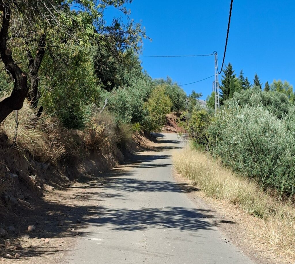
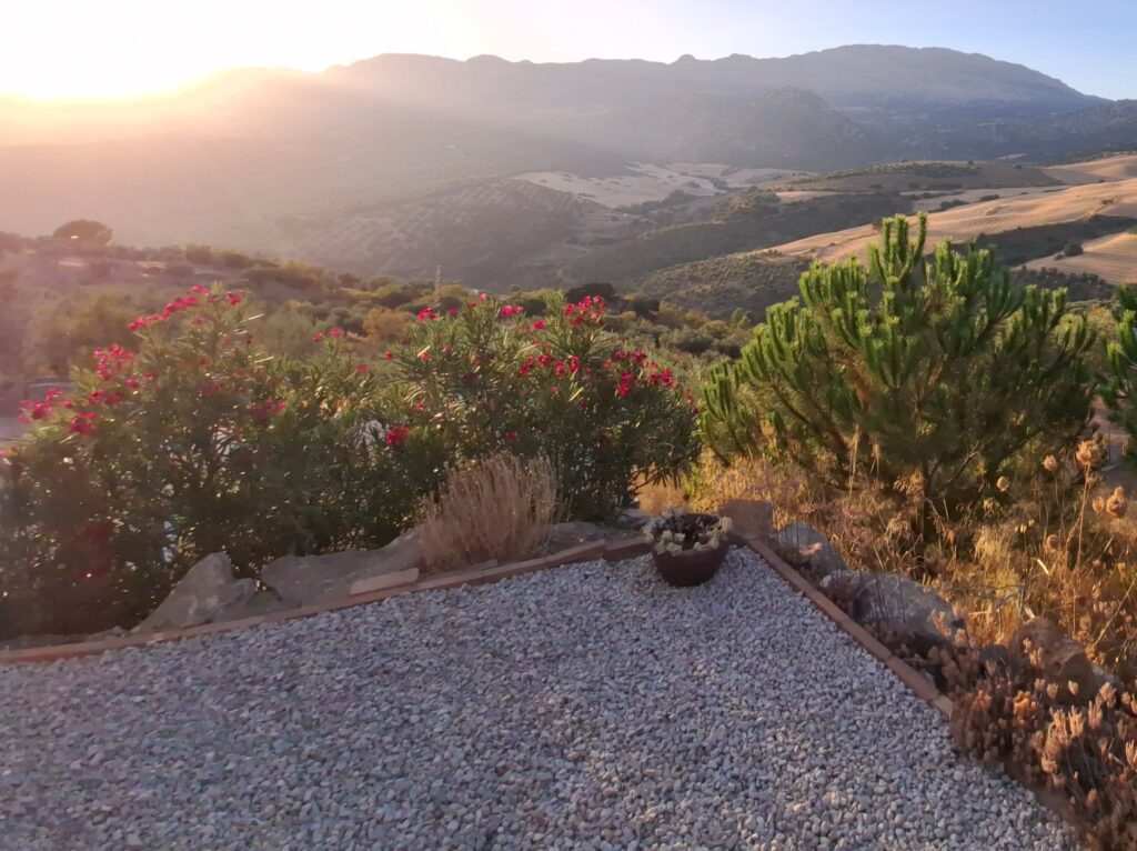
Whitewashed villages, local markets and tiny tapas bars. Mountain roads, hidden beaches, and Málaga, Granada, Córdoba and Seville within reach. We’ll share the places we love — not just the ones the guidebooks send you to.
Designed to slow you down
Buttons rest on Warm Clay #CE8F75 with a near-black clay label (6.09:1) and deepen to Clay #865D4C with a Warm White label on hover (5.20:1). Hover the button below to see the transition. Here is a sample link in the accent colour, and another mid-sentence for reading rhythm — hover those too.
The courtyard
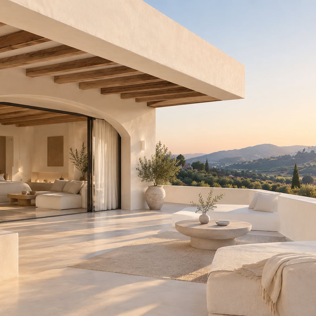
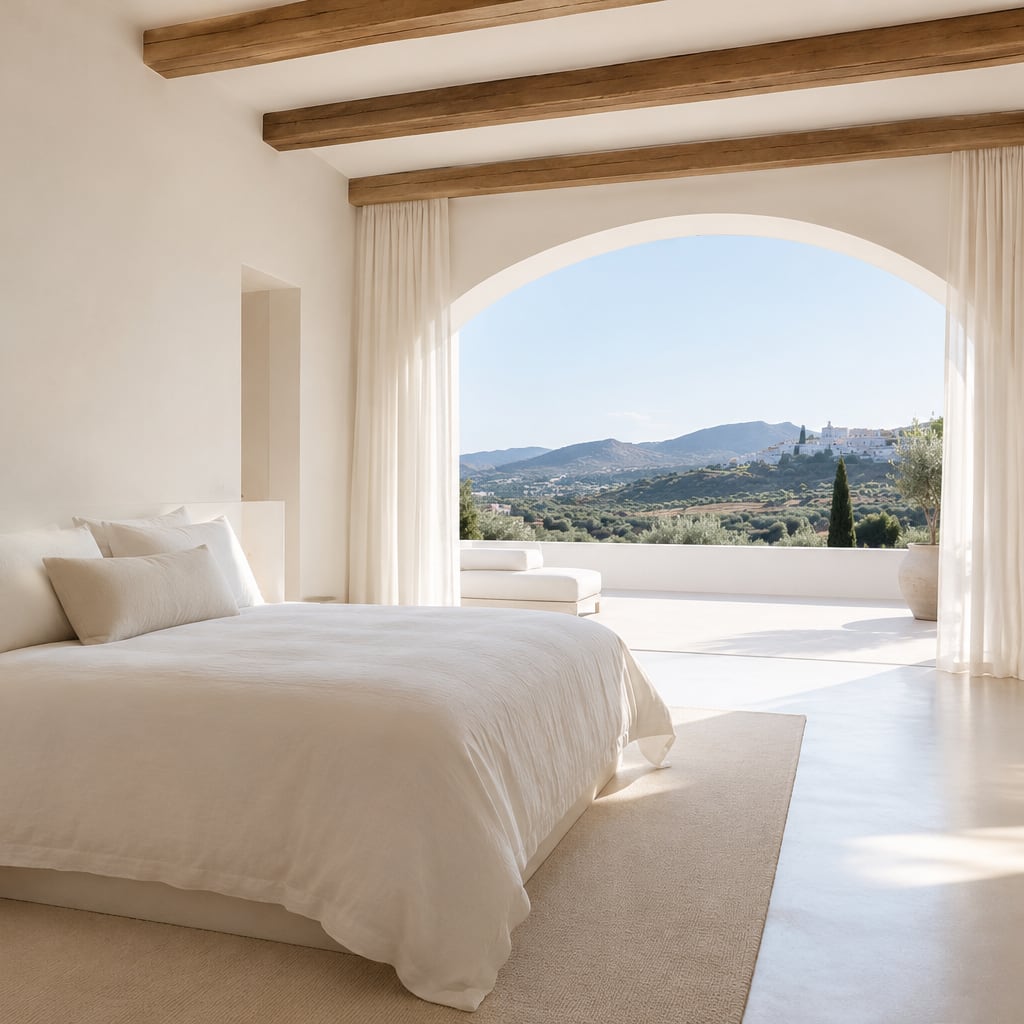
A few words of context. Keep this short — it is the caption that sets up the images beside it.
Designed to slow you down
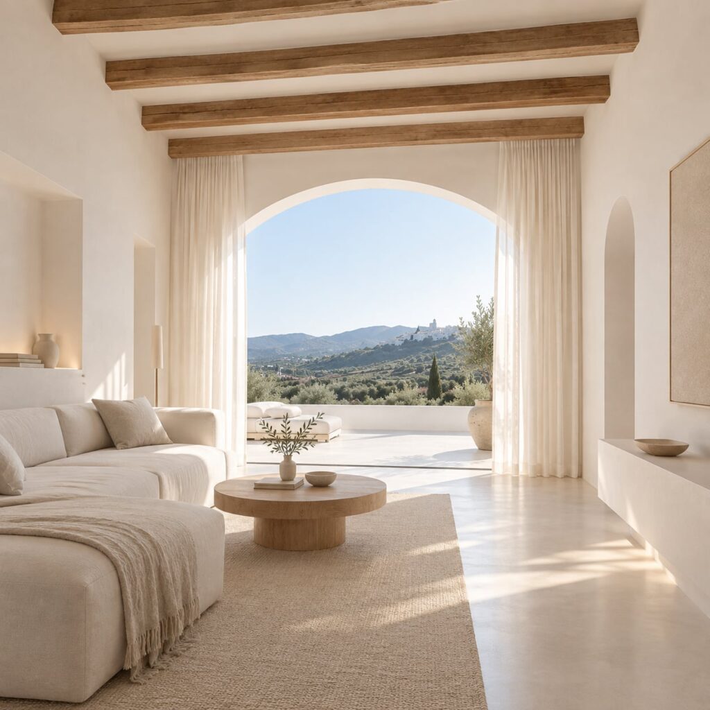
Replace this with the passage that carries the page. Held to half the grid width, a paragraph keeps a comfortable measure of around seventy characters a line, which is what makes long text readable.
The olive terrace
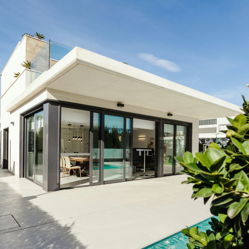
A narrow column of text set against a wide image. Keep it to a paragraph or two — at four columns wide this is a caption with room to breathe, not an essay.
The olive terrace
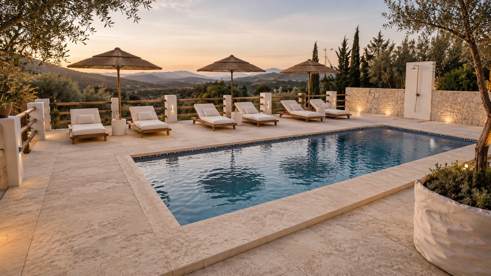
A narrow column of text set against a wide image. Keep it to a paragraph or two — at four columns wide this is a caption with room to breathe, not an essay.
Caption. Delete this line if the image speaks for itself.